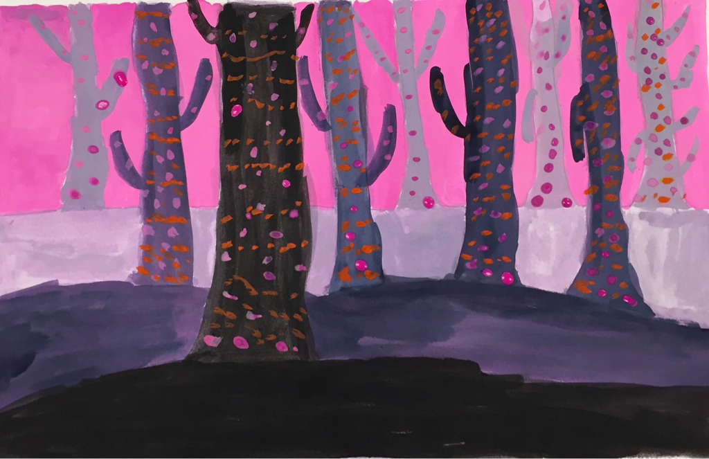
This is my spooky trees painting. I used different pink and purple pigments to make this on paper. A skill I learned was making closer things darker and further things lighter. The art element I used was value so I could make the darker objects appear closer. The design element I used was contrast by using the pink background to complement the purple ground. The mood is a scary walk through the woods at night.
This is my independent project of my hallway drawing. I used pencil to draw this on paper. A new skill I learned with this was to make more space so the area looked big. The art element I used was line. This was used to make each area of the room form together. The design element I used was proportion and scale. This was used to make every object parallel with other objects so that there was some order. The feeling is a sad day in the high school hallways.
This is my Dreamtime drawing. This was done in oil pastels. A new skill I learned was using imagination and feelings to draw something. The main art element I used was shape. I needed to have the stars and other objects to pop out and show what they are to the viewer in an obvious way. The design element I used was rhythm. The stars are in a rhythm by moving outward of the painting.
This is my flower block print. I used red and blue pigment on a clay block to make this design. A new skill I learned was printing on clay blocks. A main art element I used was value. This was used by creating more light in areas so that the flower itself could appeal better to the viewer. The design element I used was movement. There is a lot going on this image where the naked eye will follow the image likes its moving.
This is my block print. I used black pigment and rolled it on top of a clay block. A new skill I learned was how to carve block prints. The main art element I used was texture. This is used by carving out design in the block to create a rough texture on the block to give the viewer some sense of depth. A design element I used was movement. In the block is the different areas carved which lead the viewer to notice different parts of the flower that one couldn't notice.
Before After This is my ink drawing. I used an ink pen to draw this on paper. I improved on cross hatching, hatching and stippling. A new skill I learned was stippling. The main art element I used was value. I used value to make the background of the flower look darker in areas so that the flower would pop out to the viewer. The main design element I used was was pattern. This was used in the flower to show the little lines on the pedals to show the realness of the flower to the viewer.
This is my landscape painting. I used a variety of pigments and pencil to create this painting. A new skill I learned while making this was making a reflection of the water to the sky. The main art element I used was value. I used value to make the sky a darker blue the closer it is to the viewer and lighter to show how far away it it from the viewer. A design element I used in this was proportion and scale. I used proportion and scale to make the reflection of the water equal to the sky so that it gives the viewer a realistic look at the water.
This is my portrait painting. I used different pigments and pencil to draw this on paper. A new skill I learned while making this was creating a realistic look in the eyes. The main art element I used in this drawing was value. I made different parts of the face stand out so you can see places that are deeper than others to give off a realistic feel. The main design element I used was proportion and scale. This was used to make the eyes parallel to each other so that they didn't look offkilter. This makes the face look complete and not all weird looking.
This is my self portrait drawing. I drew it with a pencil on paper. A new skill I used in this drawing was shading spots where there is a shadow. A main art element I used in this drawing was value. I made the beard on the face darker because it is the darkest part of the face. Other parts are lighter so they didn't need any value. This gives a realistic look for the viewer. A design element I used in this drawing was balance. This was achieved by making 2 halls of the same face so that the look of the face would look normal. If there were no balance then the whole face would be out of proportion. This gives the viewer a easier time looking at the drawing.
This is my lead painting. This was drawn with pencil and red, green, yellow and brown pigment on paper. One new skill I learned while making this painting was blending colors to make unique colors. The main art element I used in this drawing was value. In the red areas on the top of the leaf they are a lighter red and on the sides and the bottom right they are darker reds. This gives a perspective of the leaf looking a bit older. A design element I used was emphasis. I put emphasis on the stems of the leaf in the middle going all directions to show that it has structure holding it up. If their were no stems then the leaf would simply fall apart.
|
AuthorWrite something about yourself. No need to be fancy, just an overview. Archives
January 2016
Categories |